What is a Call to Action (CTA)?
Call to actions (CTAs) are the key to unlocking the full potential of your website, amigos. Think of them as the guiding light that shows visitors exactly where they need to go and what they need to do. With a well-crafted CTA, you can create a sense of urgency, build trust, and ultimately increase conversions. And let's be real, who doesn't love conversions?
What is a Call to Action (CTA)?
CTAs are usually presented as buttons or links, and are designed to be attention-grabbing and visually appealing. They are strategically placed throughout a website to encourage visitors to engage with the site and take the desired action.
Effective CTAs often use action-oriented language, such as "Sign Up Now" or "Get Your Free Trial," and may also offer incentives or urgency to encourage visitors to take immediate action. CTAs can play a critical role in converting website visitors into customers, subscribers, or leads, and are an important part of any website design or marketing strategy.
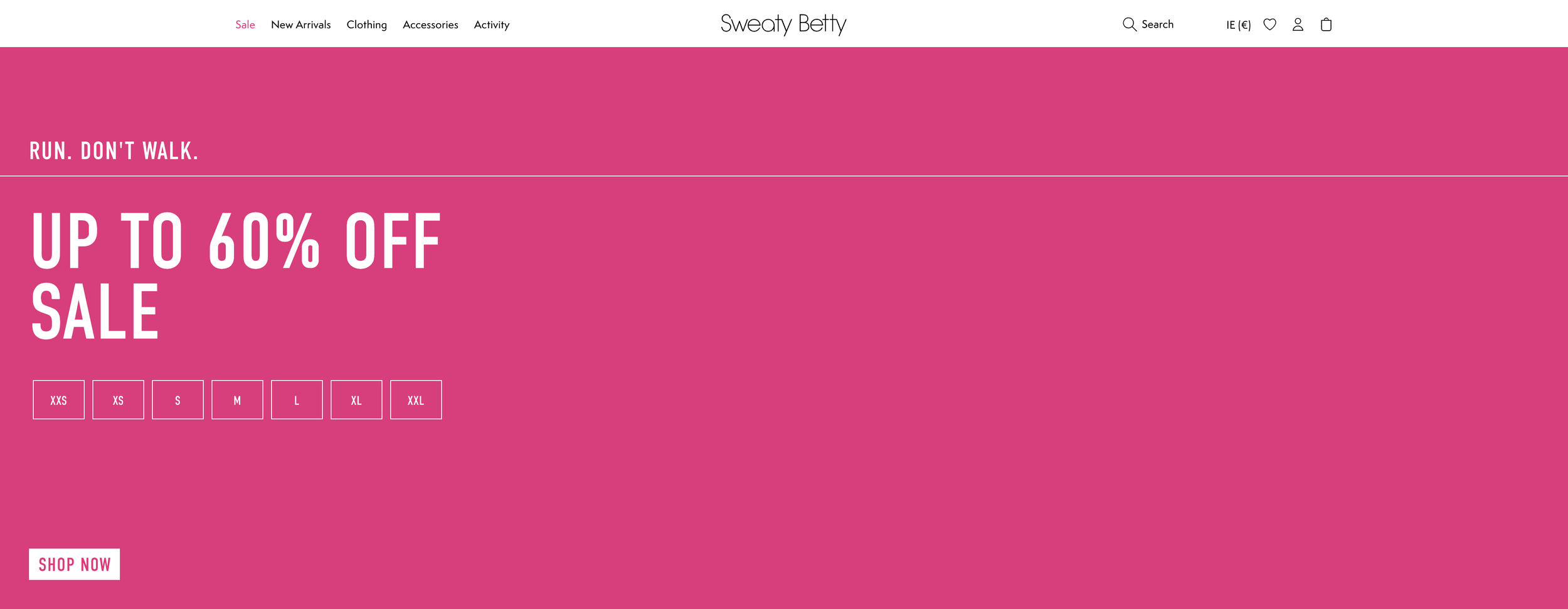
A super simple effective and clear CTA from www.sweatybetty.com.
Are Calls to action really that important on a website?
Let’s break it down. Calls to action (CTAs) are like the GPS that guides visitors to take action on your website. Whether it's buying, signing up, or engaging with your brand, CTAs make it crystal clear what visitors need to do next.
And let's face it, without a clear CTA, visitors might as well be lost in the Bermuda Triangle. That's why having a well-designed CTA is crucial for your website's success. It's like the trusty sidekick that helps you convert potential leads into actual customers.
But CTAs aren't just about making sales. They also improve the user experience on your website by providing clear and easy-to-follow instructions. This can reduce bounce rates and increase engagement, which is like music to any marketer's ears.
So, if you want to boost your website's conversion rates and engagement levels, then you need to get on board with CTAs. Just remember to strategically place them throughout your site, use action-oriented language, and make them visually appealing. Trust us, your website will thank you.
How do CTA’s improve conversions on a website?
Let's talk about the superhero powers of call to actions (CTAs) and how they can improve conversions on your website.
First up, CTAs provide clear guidance to visitors, like a trusty sidekick leading the way. They make it crystal clear what action visitors should take next, making the decision-making process a breeze.
But that's not all. CTAs can also create a sense of urgency or scarcity, like a ticking time bomb. Phrases like "Limited time offer" or "Only a few left in stock" can light a fire under visitors and encourage them to act fast.
Let's not forget about trust. CTAs that provide clear benefits and solutions can build trust and credibility with visitors. By showing visitors how taking action can help them solve a problem or achieve a goal, you can earn their trust and encourage them to take the desired action.
CTAs can also improve the user experience on your website, like a ninja making the process of converting smoother and more efficient. By providing a clear path for visitors to follow, you can reduce friction and make it easy for visitors to take the next step.
Last but not least, CTAs can be used to measure the success of your website and marketing efforts. By tracking how many visitors click on a CTA and take the desired action, you can determine which CTAs are most effective and optimize your website and marketing strategy accordingly.
So, CTAs are like a team of superheroes, each with their own unique powers that can improve conversions on your website. Make sure to incorporate them into your website design and marketing strategy to take your website to the next level.
We love this simple CTA from Netflix.com Homepage!
Should different types of Call to Action be tried and tested?
Let's talk about the importance of testing different calls to action (CTAs) on your website over time. A/B testing, also known as split testing, is like a science experiment where you compare two versions of a webpage or marketing material to see which one performs better.
By testing different CTAs, you can gather data on which one resonates best with your target audience and leads to more conversions. It's like reading the minds of your visitors and figuring out what makes them tick. You can test different CTA colors, sizes, placements, and wording to see what performs best.
Regularly testing different CTAs can help you optimize your website and marketing strategy for better results over time, like a chef perfecting a recipe. It can also help you better understand your target audience and their behavior, allowing you to make data-driven decisions about your website design and marketing tactics.
When conducting A/B testing, it's important to only test one variable at a time, so you can accurately determine which change led to the improved results. And don't forget to track and analyze the results of each test. That way, you can determine which CTA variation is performing best and make data-driven decisions based on that information.
What’s all that mean?
To sum it all up, CTAs are like the MVPs (Most Valuable Player) of your website, guiding visitors toward the desired action and driving conversions. So keep them clear, keep them action-oriented, and keep them strategically placed. With a little testing and optimization, you'll be scoring those big wins in no time.


